My T-Mobile – Customer Portal Redesign
Mobile First Customer Informed Experience

–
T-Mobile’s customer portal, My T-Mobile, had evolved inelegantly over 10 years. Customers were unable to complete transactions, which led to increased call volume to customer support and increases operational costs.
T-Mobile partnered with Garrigan Lyman Group in the redesign of key account management functionality, bill payment transactions, device upgrade e-commerce, and phone plan management launching an improved user experience to T-Mobile’s 50 million customers and small business account holders on desktops, tablets, smartphones, and feature phones.
–
Outcomes
J.D. Power Award - T-Mobile awarded the J.D. Power Award for Customer Service within the wireless category. The site held the top rank within J.D. Power’s online category, transitioning from “worst to first” in one year.
Reduce calls to Customer Care - achieving a .6 percent reduction versus the .5 percent goal.
Improved customer satisfaction scores by 8 points - surpassed average Foresee benchmarks, and is close to reaching the highest mark of excellence for authenticated telecom sites.
–
My Contribution
Led an embedded agency team of UX and visual designers over 3-years.
Collaborated with in-house product owners, business analysts, and off-shore development teams in 2-week Agile sprints.
As an individual contributor, designed wireframes and prototypes to satisfy business requirements while maintaining focus on usability and accessibility.
Conducted iterative user testing in partnership with in-house user research team to optimize monthly billing and payment, plan and services changes, and device management features.
The Baseline Experience
My.T-Mobile.com, primarily a text-based desktop-only experience, lacked clear information hierarchy, presented usability challenges, and failed accessibility standards. The design no longer followed a templated approach making changes time and resource intensive. T-Mobile’s eServices leadership team determined a complete redesign was necessary rather than continuing to make incremental improvements.

Monthly KPI Reporting & Past Research Studies
Prior to starting the redesign effort, I collected and analyzed BI reporting metrics and prior usability studies to understand the challenges the business and users experienced.
Competitor/Comparative Analysis
T-Mobile Product Owners and GLG’s design team collaboratively researched industry competitors and comparable experiences seeking inspiration how others solved similar problems across analogous industries. A matrix summarized the functional similarities and differences T-Mobile offered compared to their direct competitors.

Research Insights Document
All findings were collected into a research insights presentation and referenced through the redesign effort. New research was added periodically as teams gathered new findings from task analysis and surveys results.


A Product Vision Informed by User Needs
A mobile-first experience addressing customers top pain points.
Account Management Categorization Study
Focus group session conducted by T-Mobile’s user research team provided recommendations for the reorganization of account management features and functionality to better align with the users mental model.
Redesigned Site Map
Based on updated categorization, I created a new global site map. Customer pain points were added directly into the site map to draw attention to opportunities for improvement.
Product Owner Design Decisions
T-Mobile’s product owner assignments aligned to specific sections of user experience. To drive consistency across teams, our team led a brainstorm session and developed guiding principles for product owners to steer their decision making towards a customer first, mobile first perspective.


Concept Development
Grounded in baseline knowledge, our team set out to conceptualize a new approaches to the user experience. I led the collective team of designers and product owners through rapid concept generation activities.
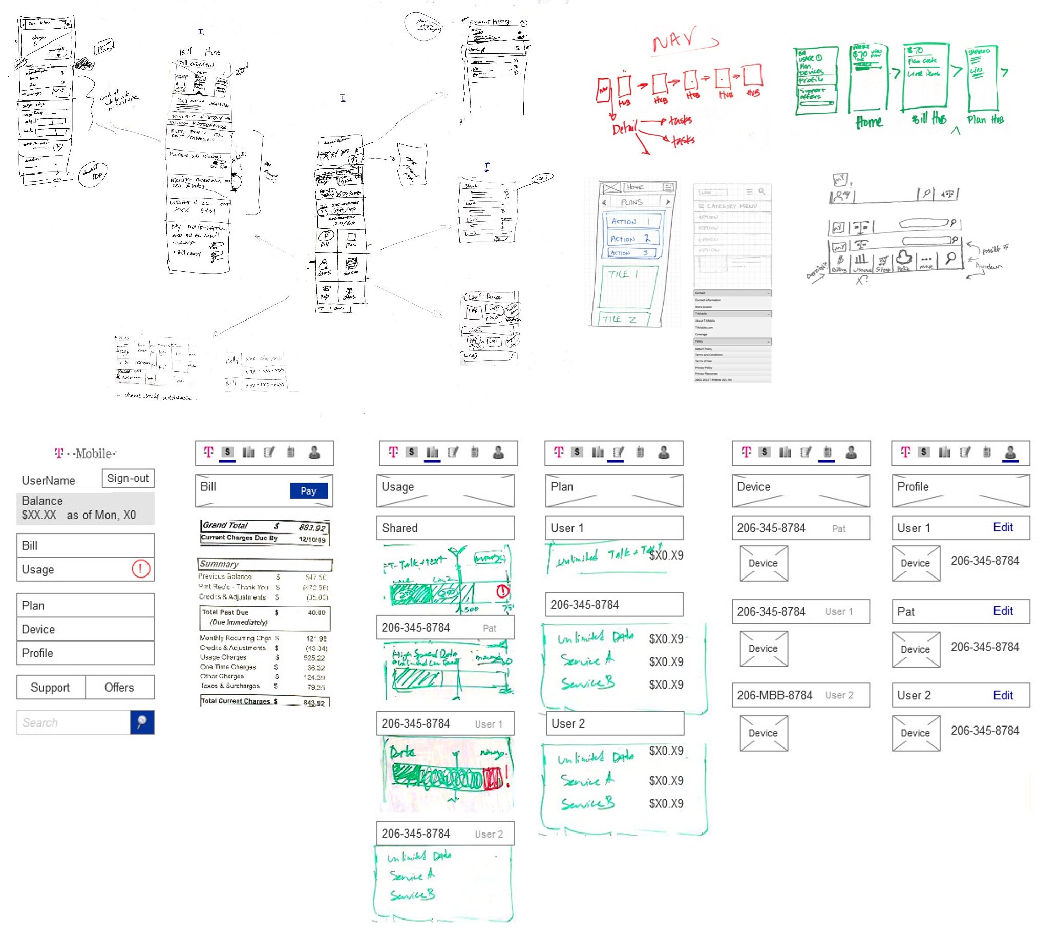
Low-Fidelity Concept Sketches
Collectively, our team sketched and collaged UI snippets to form two distinct concept approaches: a hub-and-spoke design where all functionality orientated from the home page, and a left-to-right concept that pinned a global navigation bar to the top of the page to allow the user to access each section. The left-to-right concept was selected by T-Mobile with the rational a pinned navigation system better supported the users ability to locate and troubleshoot account issues.


From Low to High Fidelity Designs
Interface designs matured from sketches into wireframes and finally into polished visual design mock-ups incorporating T-Mobile branding. I was responsible from bringing ideas from sketch through wireframe design, and partnered with visual designers to execute final mock-ups.
Paper Prototyping
I hosted prototyping sessions with product owners providing them an opportunity to collage interface elements together to create a prototype of their desired future experience. Participatory activities like these increased team cohesion and helped product owners articulate and discuss product requirements without the burden of capturing specific design requests in text-based user stories.


Concept Testing
Our design team partnered with T-Mobile user researchers to design study protocols and create testing stimulus to evaluate new design ideas. Task-based concept testing was performed using paper prototypes with the goal to evaluate concept desirability and identify unmet customer needs. Successful designs were moved forward and incorporated as final product requirements.
Three (3) in-person moderated studies were conducted throughout project (n≈8 per study)


Customer Surveys
Periodically throughout our process, we partnered with T-Mobile’s user research team to survey customers to gather input on specific research questions to guide our design decisions. Four (4) surveys were collected in total at a rate of one (1) per month (n≈700 per survey).
Rated familiarity with current features and evaluated likelihood to use potential new ones (e.g. QR codes, alerts, etc.)
Tested nomenclature describing feature names and bill charge categories
Ranked preferred design patterns


Global UX and UI Patterns
Customers infrequently visit My.T-Mobile. Learning how the product functions while troubleshooting account issues increases the customers level of frustration. I worked to ensure the product behavior followed familiar interactions patterns and rules to increase customers’ confidence in performing their desired tasks.


Multi-Step Processes
Multi-step processes are present throughout the experience to support ecommerce actions such as making payments, changing plan and service features, and upgrading devices. I created rules to ensure the proper use of progress indicators and consistent button behaviors which took into account client and service side validation.
Accordion Controls
Users needed the ability to view multiple phone lines simultaneously when managing family plans. I created rules to specify consistent default behaviors of expand/collapse accordion UI controls as users traversed the product.
Page Hierarchy
I provided component stacking rules to establish a consistent reading order of UI elements across all sections.
Line Selector Controls
Users needed to choose their desired line to modify when managing multi-line family plan accounts. I developed rules instructing the proper use, position, and behavior of a global line selector control to assist the users ability to manage multiple lines.
Change Indicators
For customers, understanding billing changes from month-to-month drove majority of the calls to customer care teams. To increase clarity, I incorporated bill activity notation to summarize new charges and help customers uncover billing abnormalities.

Collaboration Across Teams
I led the team in establishing a standardized work cadence that aligned with sprint schedules, provided time for design teams to explore solutions, perform user testing, gain stakeholder approval, and publish robust documentation to ensure the experience was built as expected by off-shore development teams.


Sprint Ahead
Product owners worked closely with UX and visual design practitioners 1 to 2 sprints ahead to create wireframes and UI designs capturing all necessary requirements with T-Mobile branding applied.
Wireframe Design
Designs for mobile and desktop were created simultaneously side-by-side. Hundreds of wireframes were created and annotated to capture business rules for all types of customer accounts, and depicting all states of the interface based on the customers phone plan and account payment status.
Use Case Index
Story Mapping
Site map pages were mapped to agile use story numbers to correlate designs with requirement documentation.


Final Designs for My.T-Mobile.com
Successes & Lessons Learned
The Account Management Mindset - My.T-Mobile site visits primarily occur when customer detected abnormalities with their account; most notably, an unexpectedly high bill or the need to manage wireless service features. A major ah-ha moment for our team was observing through user testing the frustration customers experienced troubleshooting challenges while simultaneously learning how to use a new interface. Adding to the frustration, online account management experiences differ from one company to the next! Our teams adopted a simplification strategy favoring the removal of non-critical information. We incorporated alert and notification systems directly into the visitors navigation path to remove the need to hunt for account issues. We relied on visual indicators that depicted month-to-month changes, and designed prominent confirmation messages emphasizing task completion. Through our testing we observed increased participants satisfaction and confidence of task completion.
Consistency - When multiple product teams work simultaneously, the overall product experiences risks delivering a consistent experience to end users. As each product owner advocated for UI patterns to specifically handle user cases they were assigned to solve, the product quickly evolved into a disjointed experience. To remedy this challenge, I established a recurring design critique with all product owners and designers to review all design patterns across the experience, identify variations, facilitate conversations, and rationalize to a single UX/UI interaction model to simplify the user experience and development effort. The result of this work was a published set of global rules and guidelines adopted by designs and product owners leveraged for future design decisions.
Sprint Ahead / Agile-fall - This project involved hundreds of people working across geographically distributed teams. T-Mobile had brought together design and development vendors to partner alongside product owner teams with the expectation to adopt an agile/scrum delivery model. The first several cycles were especially challenging with development ready to build without any approved designs! UX designers and product owners routinely felt the pressure of preparing designs and requirements for the upcoming sprint while simultaneously responding to mid-sprint development needs. If I were to run this project again, I would spend time upfront establishing a cross-team sprint schedule which accounts for hand-offs between vendor partners. Having additional clarity on the timing of key collaboration points would have reduced multi-tasking.